| BRANDING
ekphrasis bridges Filipino fine arts with poetry, inviting junior high students to immerse in a gallery and create verses from the experience.
SKIP TO WORKFORM AND FUNCTION
POETRY, ART, AND DESIGN
While the project is all about poetry and art, design comes into play as a supplement externally, as a means of promoting and branding the project. The client invited me to work with them in creating a logo mark for marketing materials, but also for use within the project as a label in the exhibit. In addition to this, promotional materials such as invites and posters were also requested. We worked together closely and with the other stakeholders in this very collaborative project.
WHAT HAPPENS NOW?
DESIGN PROCESS
1
CONSULTATIONS
& RESEARCH
2
EXPLORATION
& ITERATION
3
ASSETS &
LAYOUTS
4
FEEDBACK
& REVISIONS
The first step was understanding the scope and context of the project, and this was done through consultations with the client. They had a logotype and an initial vision ready, so what I was tasked to create were: a distinct brand mark primarily for the gallery exhibit; and print designs for marketing the project.

The client’s vision was for at the project to be childlike and playful, so I played around with bright colors and concepts such as building blocks and kids drawn in a children’s book style.
I brought these back to the client, and discussed further what worked best for the project.
Tools: Adobe Illustrator

Upon finalization of the direction we were heading towards, I created the final brand mark as well as illustrations that served to supplement this.
From here, I also created the layouts for the different print materials needed for the project, namely the poster, invite, and book cover.
Tools: Adobe Illustrator, Adobe InDesign

While I always kept in close contact with the client, the project also had its own stakeholders like the publication organization and the art gallery.
Consequently, there was a lot more feedback to address and take into account, and these were resolved accordingly.
Tools: Adobe Illustrator, Adobe InDesign

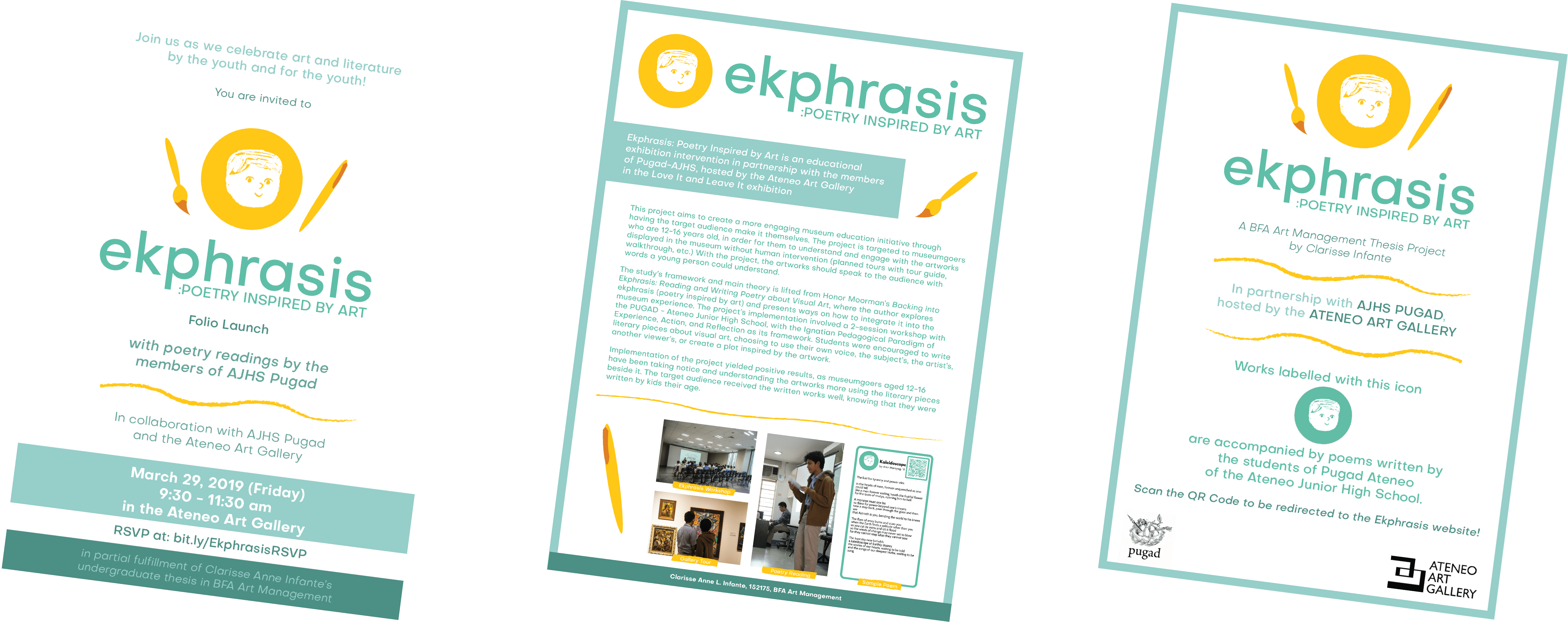
AN EXHIBITION OF DESIGNS IN
EKPHRASIS
The first pieces of work for the project were the brand mark, a complement to the existing logotype, and a few illustrations that served as assets in further designs. These designs involved creating layouts for publication and promotional materials.
BRAND MARK
The brand mark we decided on was this illustration of a boy. Its main role was to be easily identifiable in the gallery setting, as this was used to label the poems displayed alongside the respective artworks that were used as subjects. The boy was meant to show an underlying goal of the project, which was to show that younger audiences can also appreciate art, even if not in the way intended by the artist or curator.
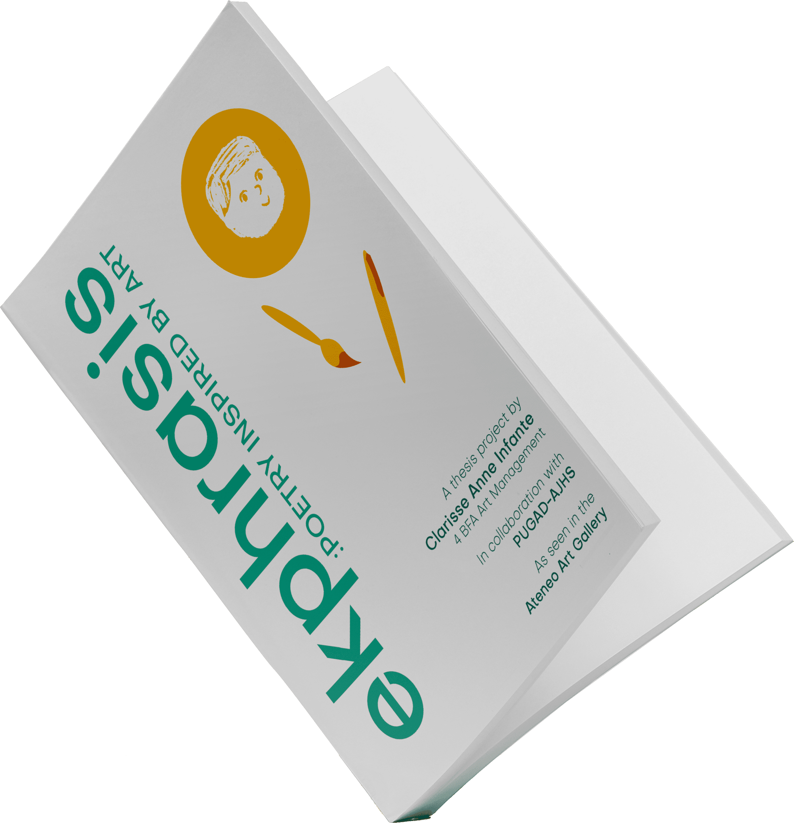
BOOK COVER
This design was used as the cover on one side of the organization’s publication, which featured the project and the poems made through it. The booklet was given to guests and stakeholders during the project exhibition, where the students read aloud their poems.
MARKETING MATERIALS
These print materials were used for promoting and marketing around the school, in the gallery, and to the stakeholders and guests of the project.