

| BRANDING
Amboy-Baby Consignacion is a fish-farming and supplying family business looking for a fresh look to work with.
SKIP TO WORKSAME FISH,
FRESHER WATERS
Wanting a new, distinct, and unified look for their brand after a string of altering logos and designs, the client asked me to work with them in creating an up-to-date brand signature. We established together a cleaner and modern direction, while playing around with themes already present like in their boat designs. The rebranding also involved updating the stuff they use for work, and we started with shirt and cap designs they can use in their daily activities.
WHAT HAPPENS NOW?
DESIGN PROCESS
1
CONSULTATIONS
& RESEARCH
2
EXPLORATION
& ITERATION
3
PRESENTATIONS
& FEEDBACK
4
REVISIONS
& MOCKUPS
During the consultations, I made sure to understand where the business was coming from, such as knowing why they wanted a new logo, how they see their brand, who they interacted with, and the like. I supplemented this by researching about the industry, like their competitors and target market, and their own operations, such as the types of fish they harvest and the boats they use.

Based on my research and what the client was looking for, I created several concepts we could look into further. The notable ones I created took inspiration from the the letterings on their boats
(e.g. a combination of slab-serif and italic letters), the initials of their brand name, and milkfish, which is their main product.
Tools: Adobe Illustrator

I went over the best designs with the client, and discussed which ones they wanted to pursue. What was interesting for me during this discourse was that the client eventually decided on a concept that was more traditional and closer to their previous look, over one that was modern and minimalist, a style they initially wanted. We chose the best concept that suited them, and I made all the revisions needed accordingly.

Finalizing the direction to take, we also went over the colors that would suit their brand, again taking from what they already had but with cleaner and more modern tones.
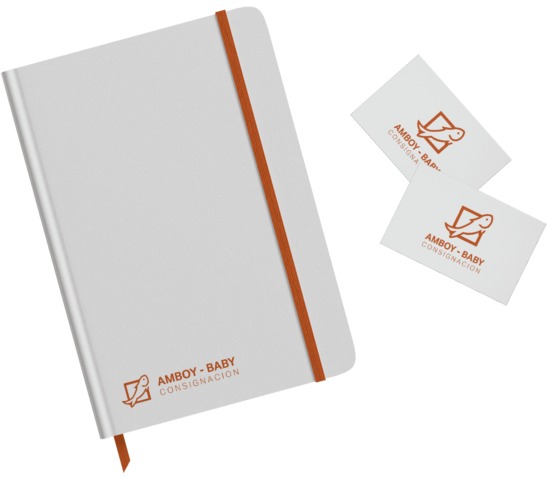
We applied these new elements to items they were looking to make then, such as shirts and caps for their their employees. Designs for stationery were also discussed, but were deemed not essential yet during that time.
Tools: Adobe Illustrator, Adobe Photoshop

REELING IN THE FRESH LOOK OF
AMBOY-BABY CONSIGNACION
Working with the scope, we started the rebranding with a change in signature, opting for a sleek, clean mark and logotype. We used these as the central elements in designing the rest of the deliverables, from caps to shirts.

SIGNATURE
The brand mark aims to visualize the two main aspects of the business: fish-farming and supplying. The first is illustrated with the fish bordered by a square depicting a fish pen; and the fish bending to the upper right showing a supply curve. The logotype is made with a contrast of a bold and a light font, taking inspiration from the contrast of thick slab-serif and thin italic lettering on their boats.
CAP
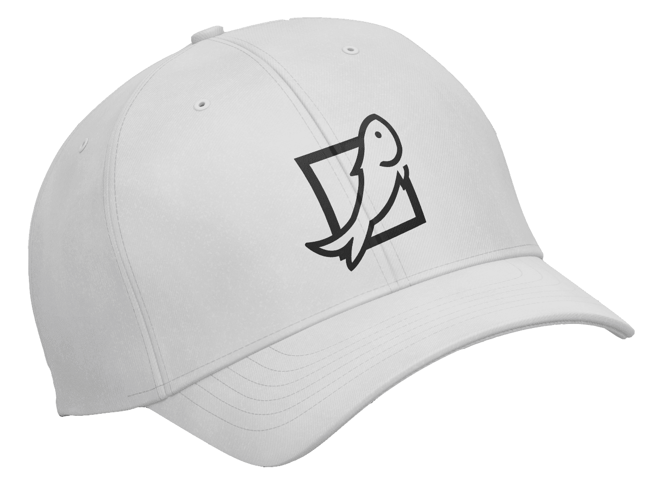
With most of the work done under the sun, caps were an essential element of what they wanted to showcase their brand. Simple and clean, the cap has the brand mark embroidered on the front, making it distinct and identifiable. The cap design has another variation, with the brand mark in white being embroidered on a black cap.

SHIRTS
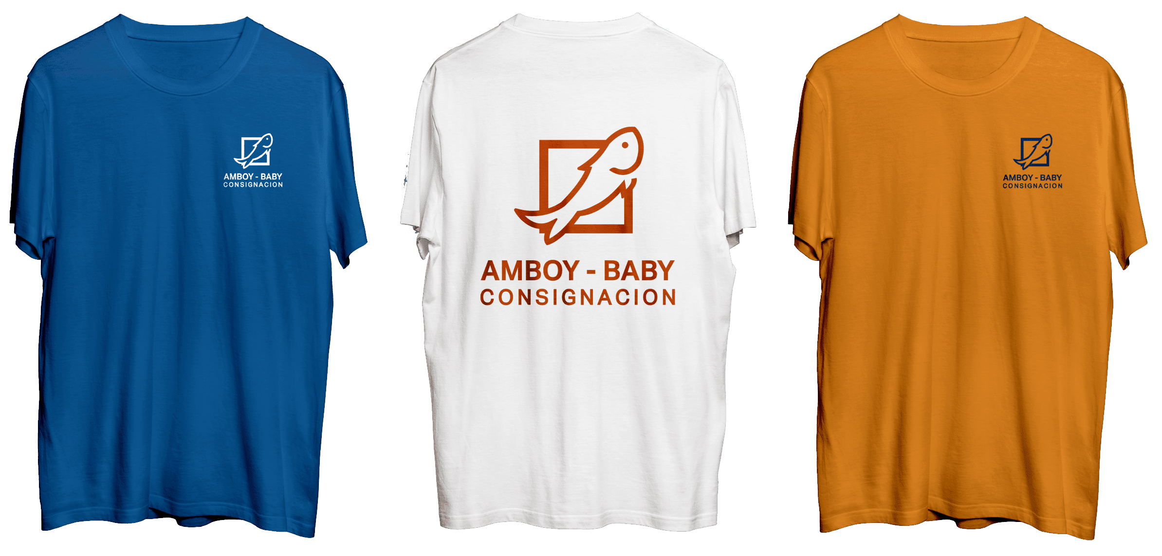
The client wanted several shirt designs for the employees, and we used the three colors of the brand. Each design shows the brand signature on the left chest area in the front, and in a huge portion of the back. These make the shirts and employees easily distinguishable, particularly when seen outside in the farming area.


